09 · 10 · 11
The identity system.
Loud comic book pop art, meticulously drawn, never cartoony. Loud outside, serious inside.
09 · Packaging system
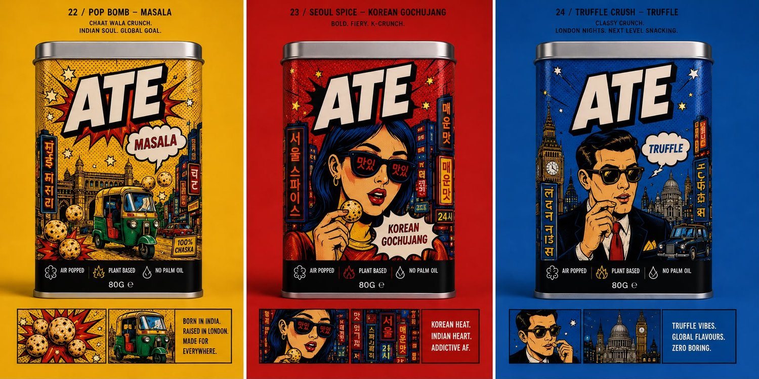
One silhouette. Three colour systems.
Format
- Dimensions
- 90mm wide × 90mm deep × 170mm tall, square format.
- Fill weight
- 80g.
- Lid and finish
- Tight fit metal lid, matte body finish with spot UV on the ATE logo.
- Silhouette
- Consistent across all three SKUs. Colour and illustration do the differentiation, not shape.
Hierarchy on front
- 1ATE wordmark, always the largest element, always in the comic burst treatment.
- 2Flavour name, in a speech bubble or callout, secondary to the wordmark.
- 3City illustration, full body art wrapping around the tin, colour coded to the flavour.
- 4Certifications strip along the base: Air Popped, Plant Based, No Palm Oil.
Back of pack, non negotiables
- “Left No Crumbs.” call out in a speech bubble.
- Ingredients list, allergens and nutritional information, clearly typeset.
- Founder line: “Born in India. Popped in London.”
- Barcode, batch code, best before, treated as part of the design, not hidden.
10 · Logo and wordmark
The loudest thing on the pack.
The ATE wordmark is the single largest, loudest element on every pack and every piece of communication. It always appears in the comic burst treatment: heavy, slightly imperfect display letterforms with a thick ink outline. It is never set in a plain sans or serif substitute, even in early drafts.
Clear space
Keep clear space around the wordmark equal to the height of the letter A in ATE, on all sides, free of other text or illustration.
Minimum size
On an 80g tin the wordmark should never take up less than roughly a third of the front panel width.
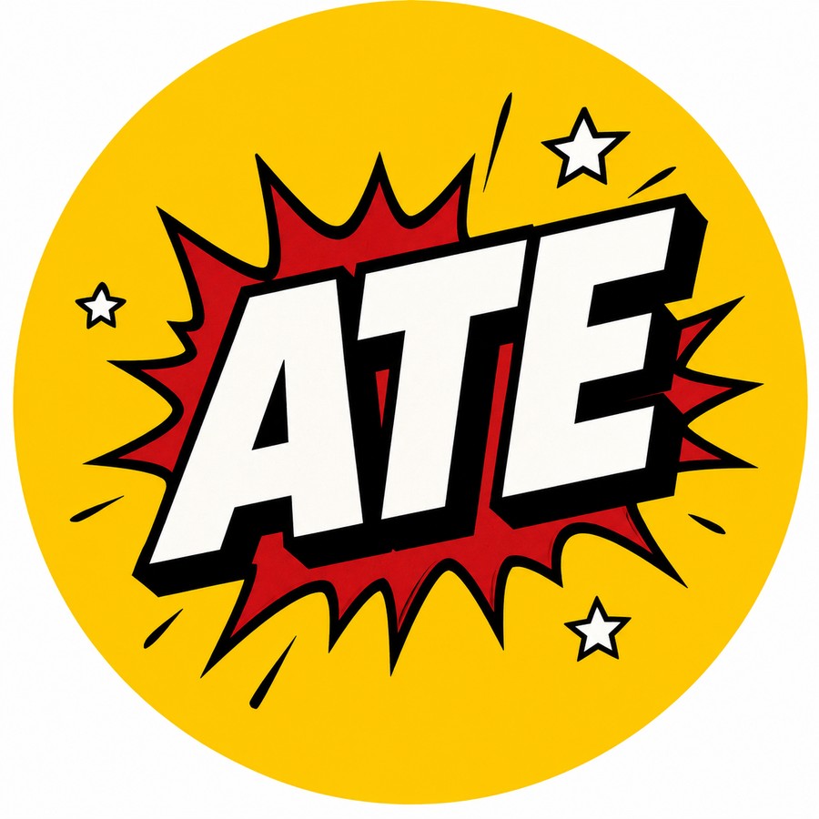
Primary lockup
Comic burst treatment on the Mumbai Masala yellow.
Correct & incorrect use
Do
- ✓On ink or cream backgrounds only, per the colour system, always with the full comic burst treatment intact, never simplified into flat type.
- ✓The period after ATE is part of the mark and is never dropped.
Don't
- ✗Do not recolour the wordmark outside the approved palette, or stretch, skew, rotate, or add a drop shadow or gradient to it.
- ✗Do not place the wordmark over busy photography or low contrast areas of an illustration.
- ✗Do not pair the wordmark with a different tagline or founder line than the ones set out in this document.
11 · Visual identity direction
Loud comic book pop art. Meticulously drawn. Never cartoony.
Colour system
Mumbai Masala
#F5C518
Yellow, on ink
Seoul Heat
#C62828
Red, on cream
London Noir
#1E4FA6
Blue, on cream
Ink
#111111
Universal support
Cream
#F6EFDD
Universal support
Typography
- DisplayA chunky, hand cut sans in the ATE wordmark treatment. Heavy, slightly imperfect, always with a thick ink outline.
- LabelsAn all caps industrial sans for callouts, badges and certifications.
- BodyA clean serif for long form copy on the brief, website and back of pack storytelling.
Motifs to use
- ★Halftone dots as texture, not as decoration.
- ★Comic bursts, speech bubbles, stars and thick ink outlines.
- ★City illustrations rendered as pop art panels, never as photography.
Motifs to avoid
- ✗Watercolour, hand lettered wellness aesthetics, generic exotic flourishes.
- ✗Gradient backgrounds, drop shadows, anything that reads as an app screen.
- ✗Stock photography of hands, bowls or blurred kitchens.